

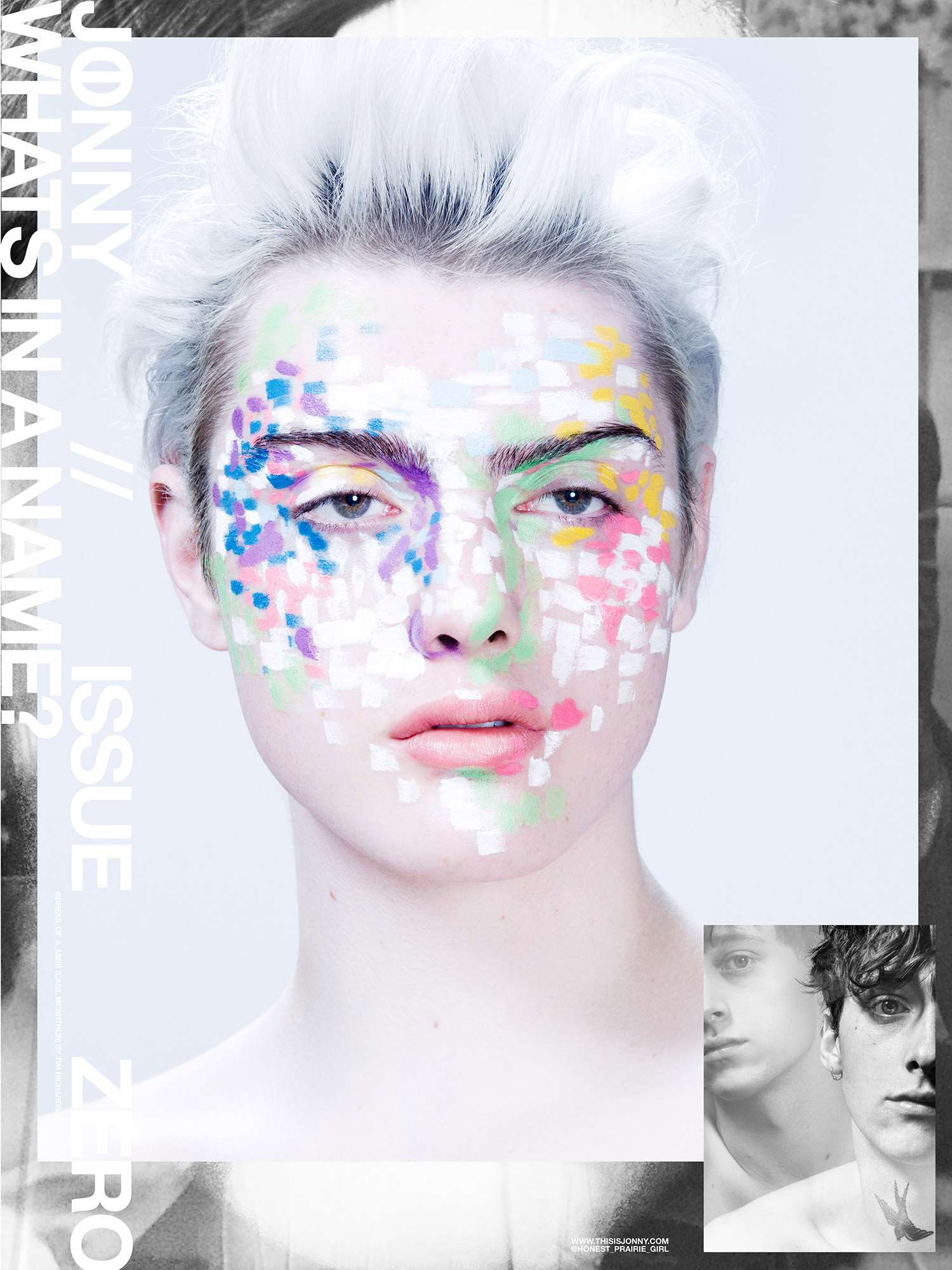

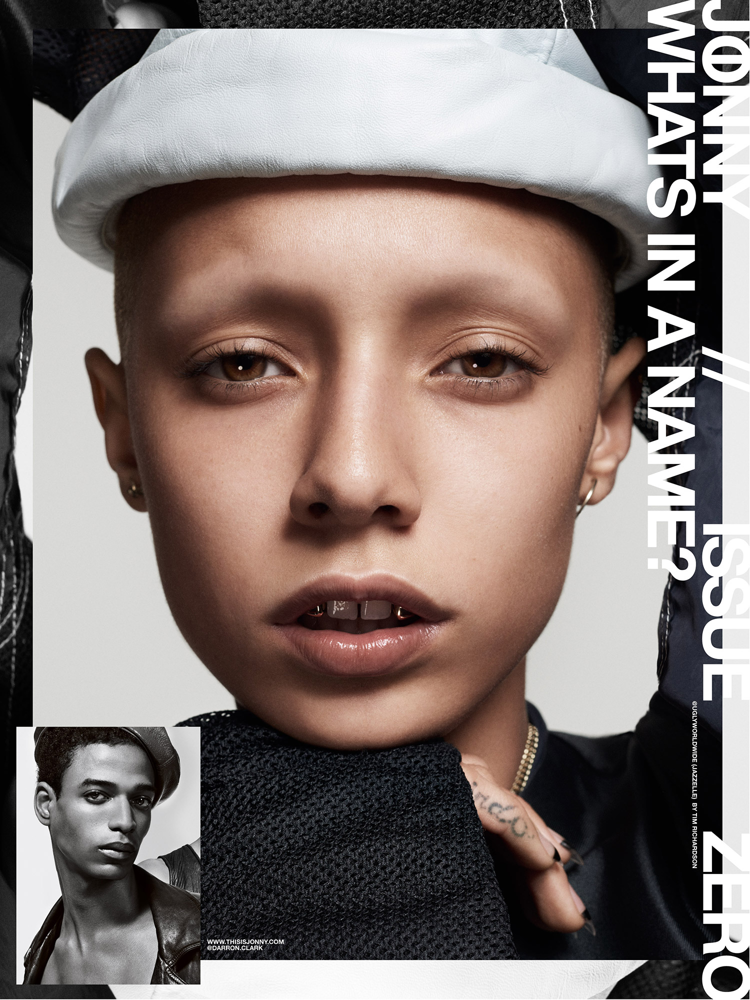


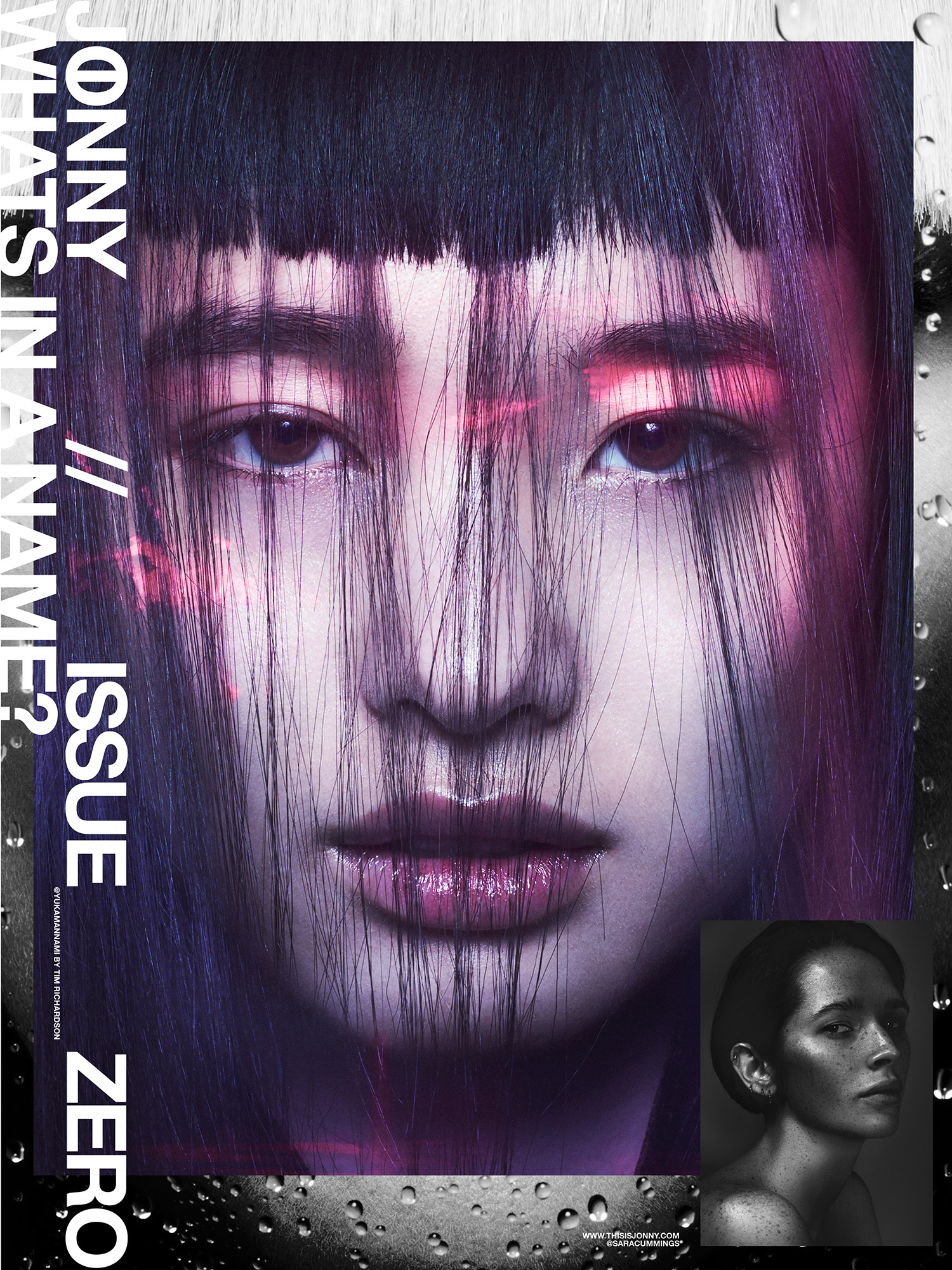

Oversized poster-zine JONNY has something big to say
When did the idea of starting JONNY move from just that–an idea–to something “in the works” all the way to issue 0?
Tim Richardson: JONNY grew from a conversation between Amir and I in early Summer 17. We were seeing our community returning to its roots. From Lady Fag’s Holy Mountain parties to the emerging new downtown scene; it all inspired the same desire to channel that energy into something authentic.
That was our trigger. There was no moment of “can we do this?” It was only “Yes, let’s get to work.” We decided to do a zine – something intuitive and open where we could celebrate the diverse beauty of the community around us. We called all our incredible friends and partners, and with a bit of fortitude, JONNY issue 0 was born.
How does JONNY plan to use visuals to be part of the conversation in the current industry climate?
In this wider social climate celebrating diversity is a beautiful kind of defiance. Amir and I took that as our inspiration and founded JONNY with the simple idea of ‘recasting’ rebellion.
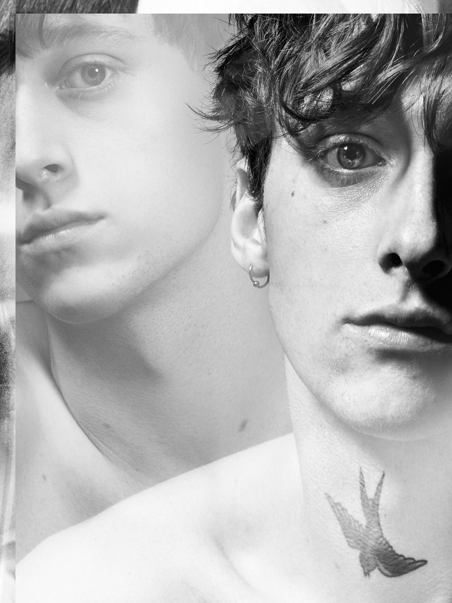
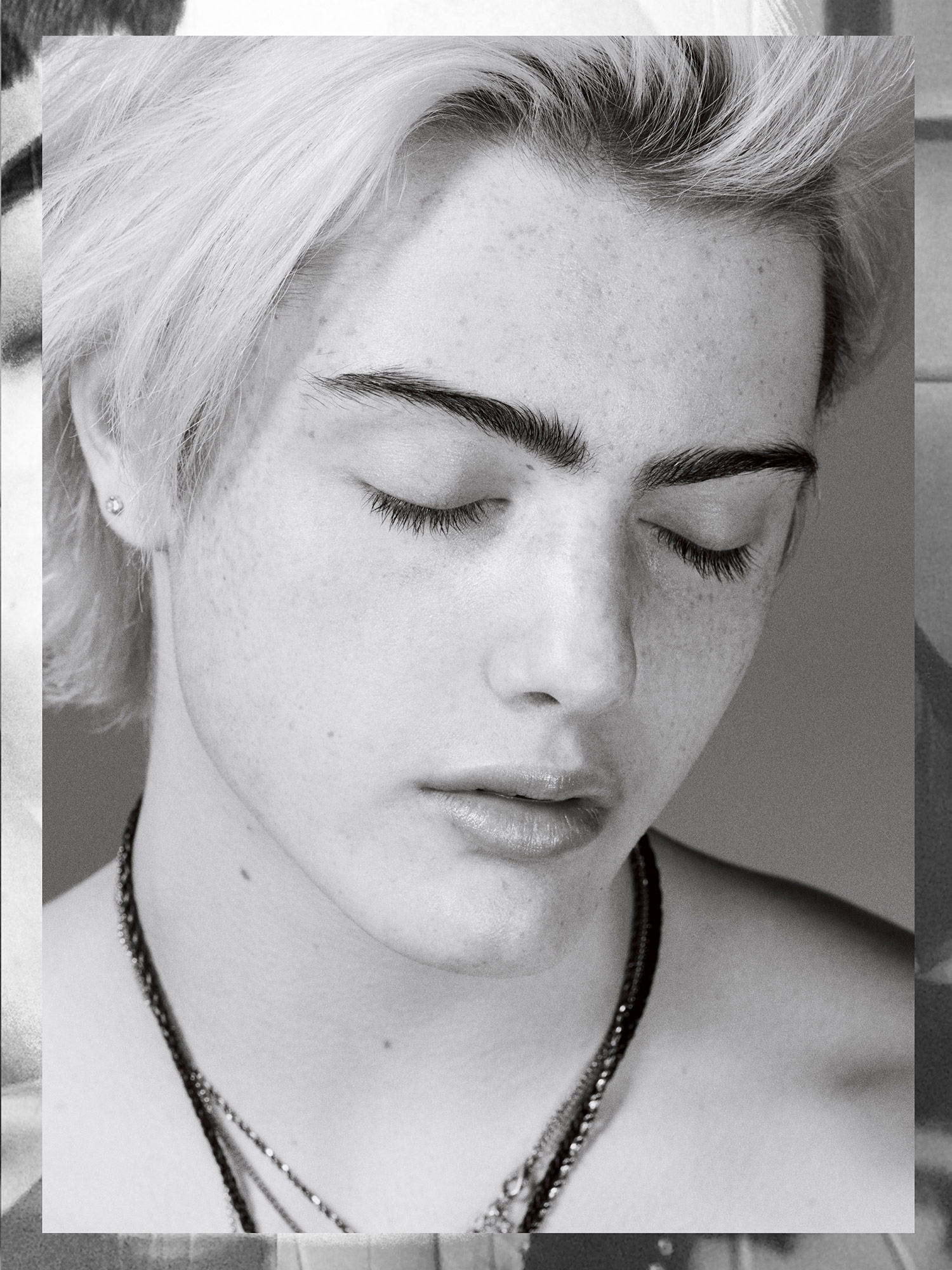
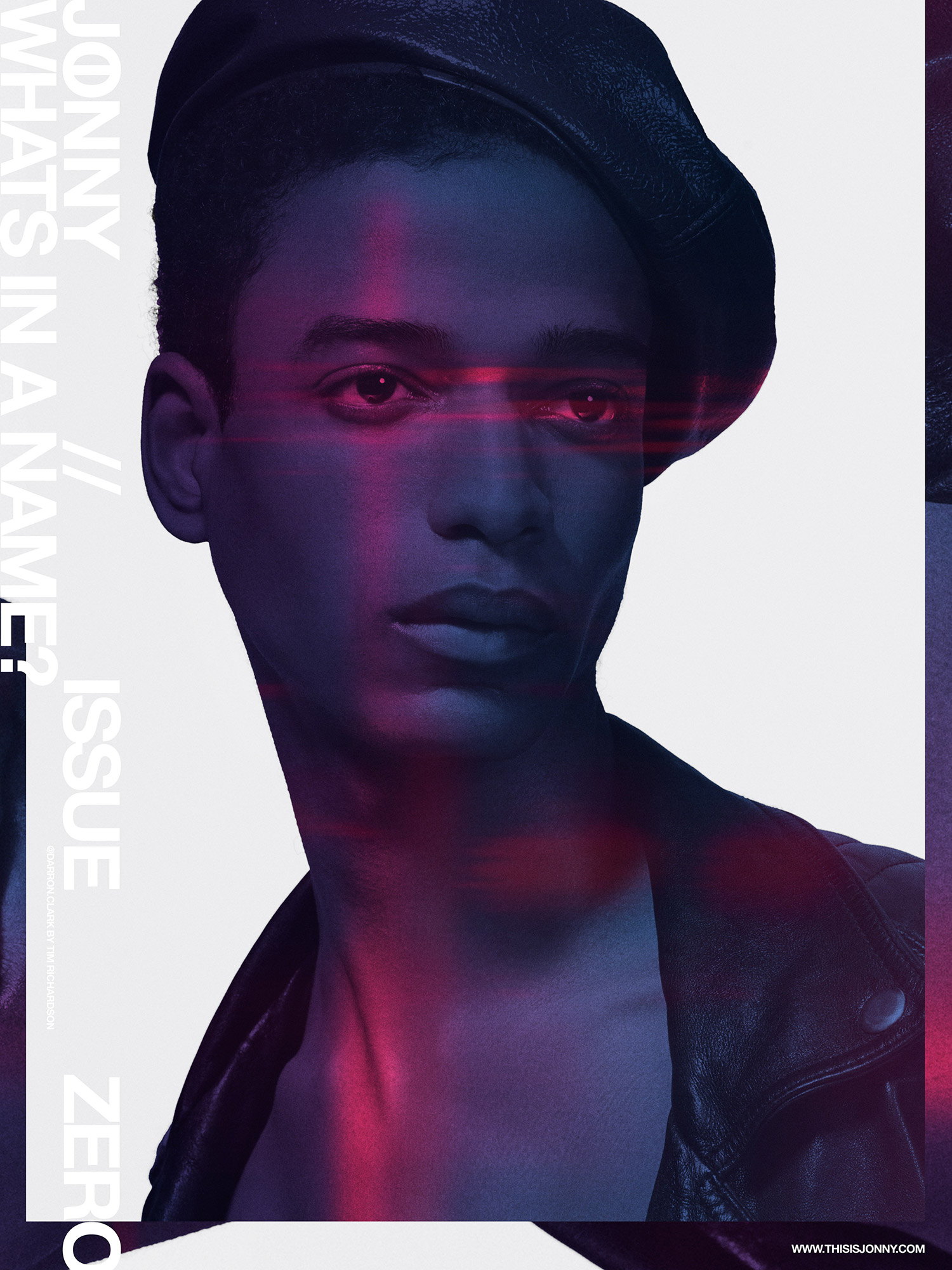
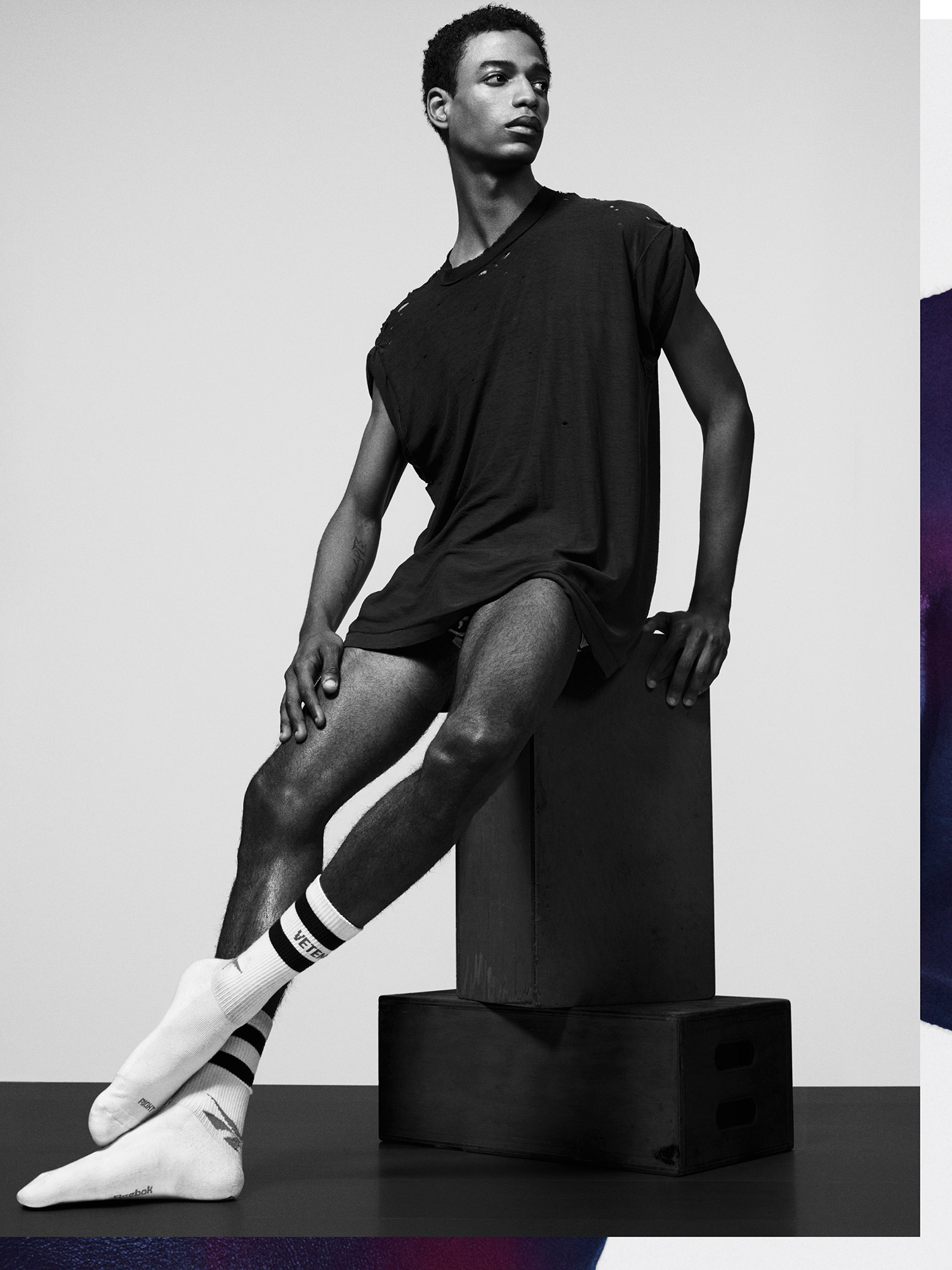
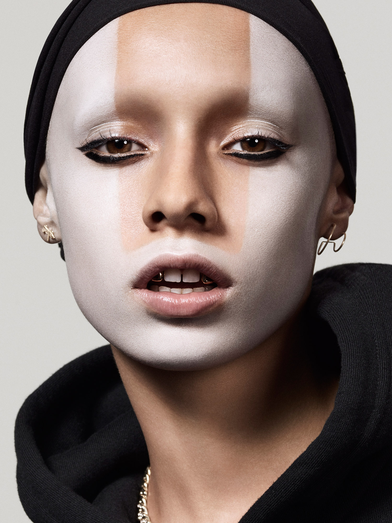
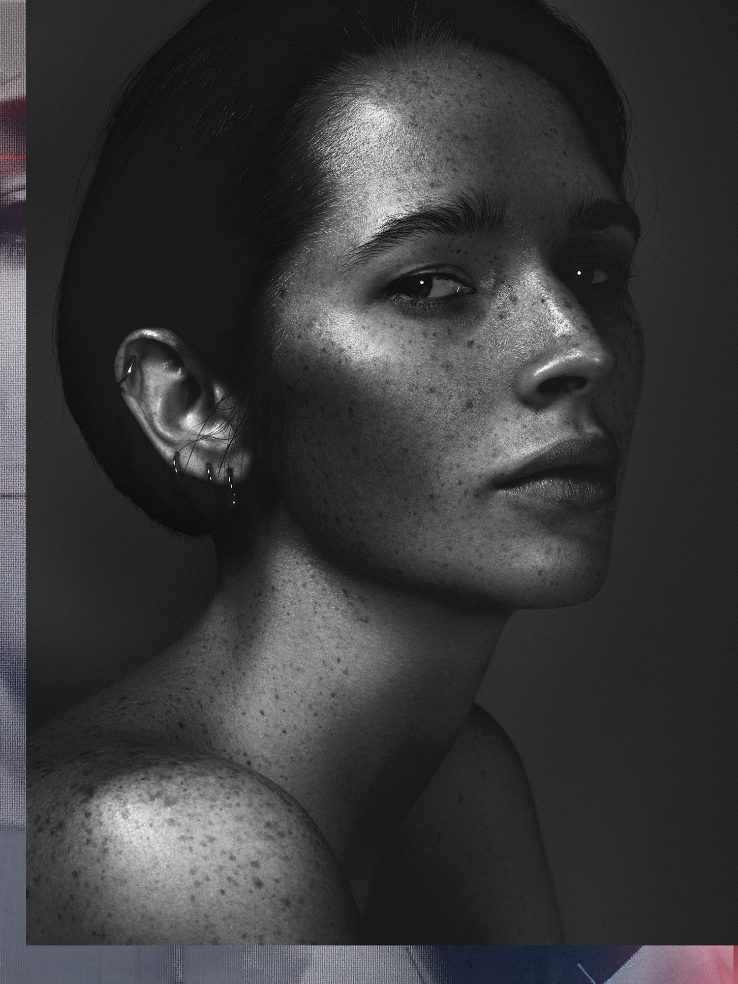
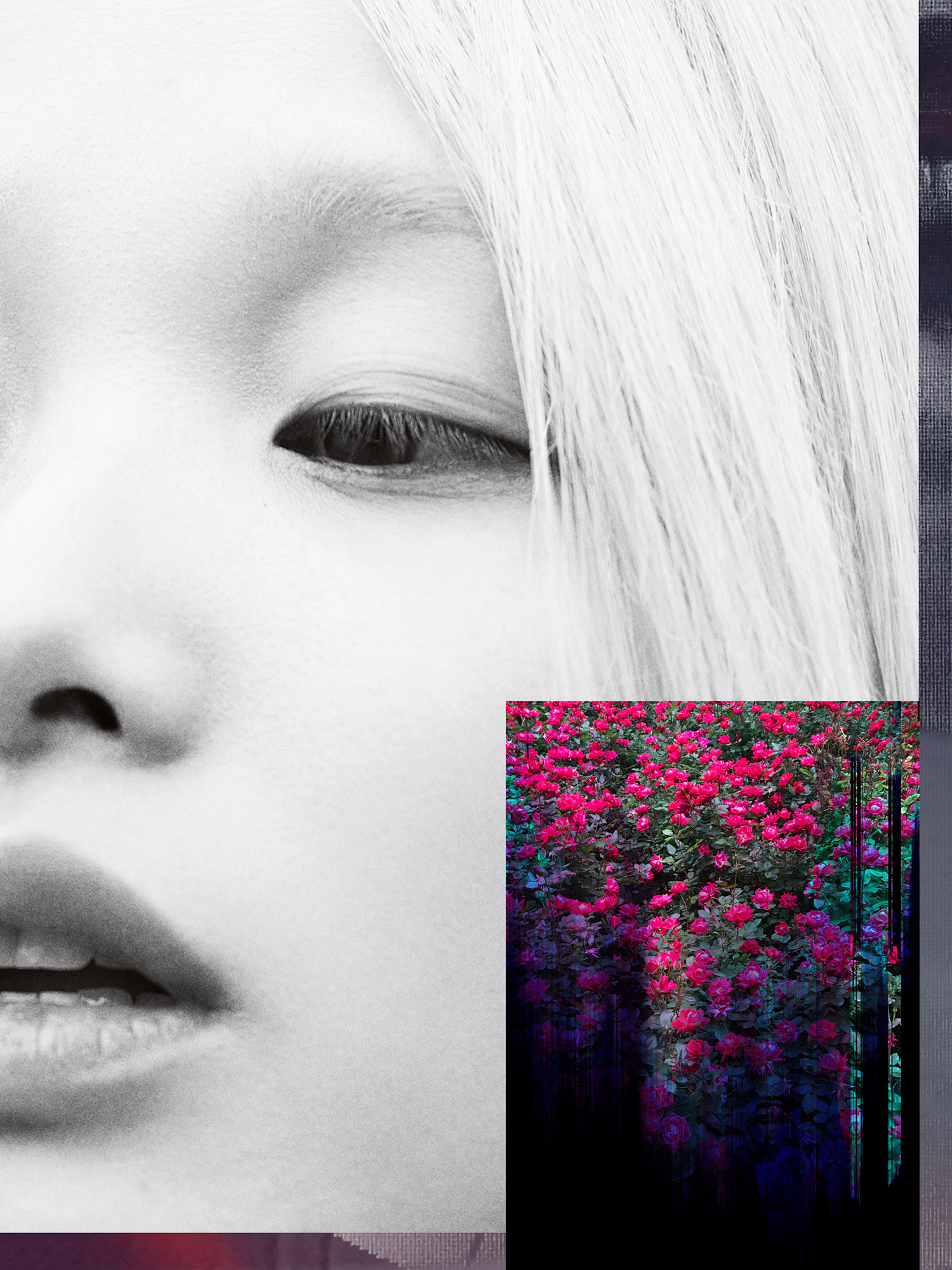
We decided to to focus on the what makes each person unique. To celebrate the individual through the lens of beauty and portraiture. All we can hope for now is that JONNY will add a unique voice to the broader conversation of gender, sexuality and race.
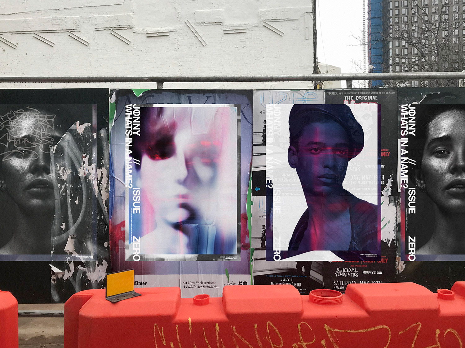
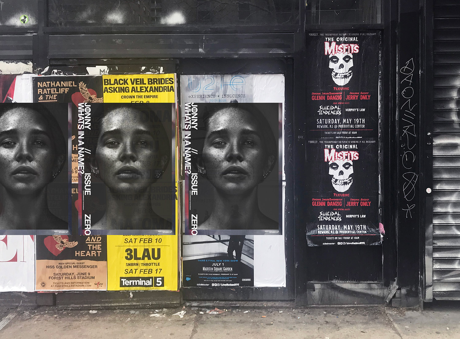
Why the oversized format? How does it differ from the typical magazine?
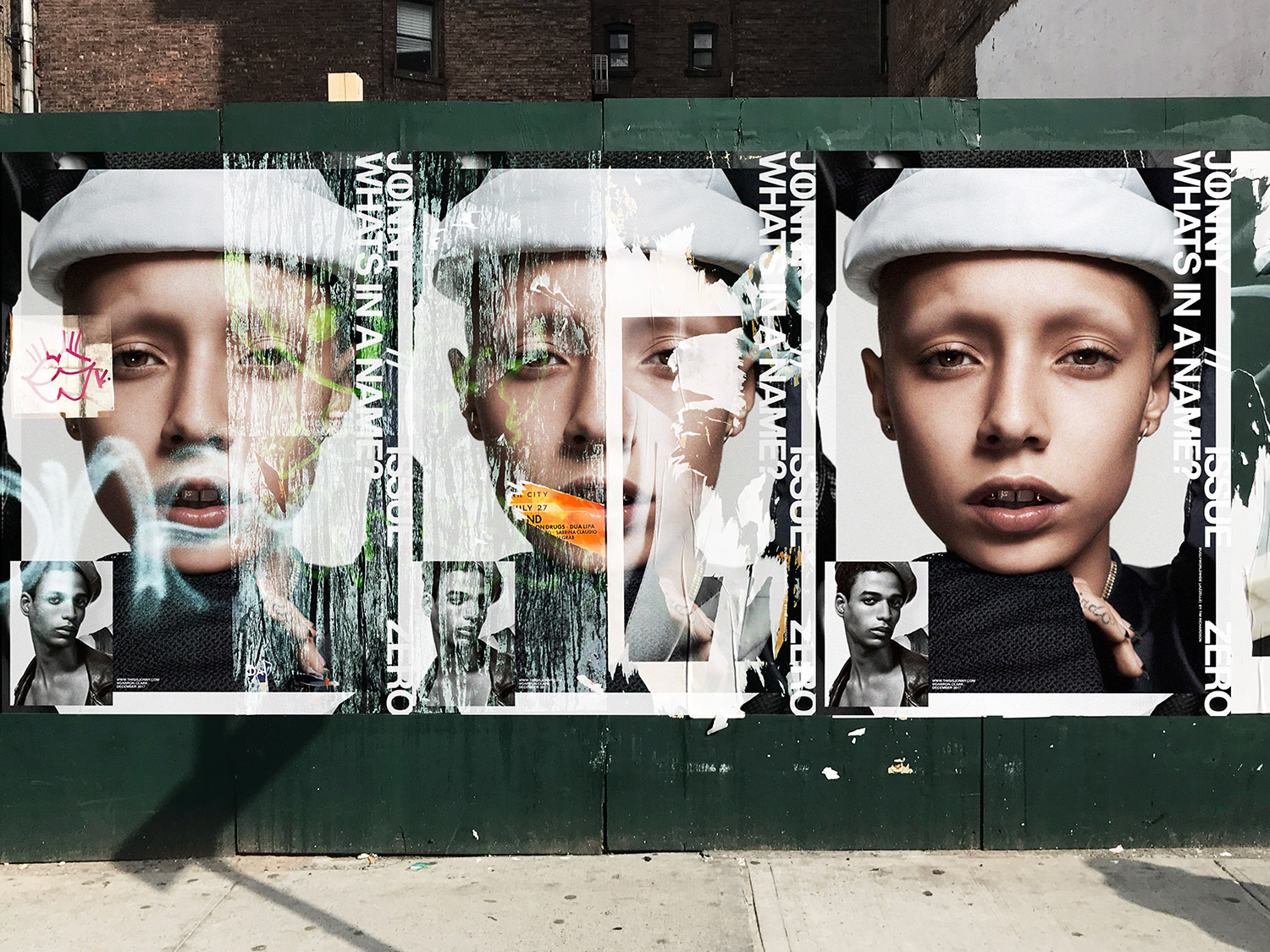
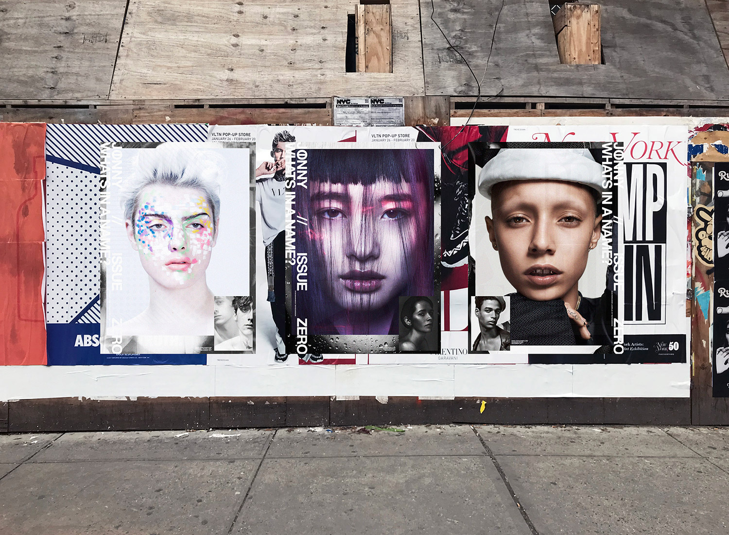
The poster format is not typical for a publication, but it felt right and disruptive for issue 0. You can’t just flip the pages to understand it, it takes some time to open and close and shift through the 3 posters. When everything iPhone size or smaller, it felt radical to make something the opposite – closer to the ethos of rebellion.
How do you envision the magazine evolving over the course of the next few issues?
Launching Issue Zero as a poster zine was the perfect way to give JONNY a unique character from the get go. We always imagined Issue Zero as a prelude to Issue One. A way to set the tone for the title. For Issue One we’re increasing the scale of the project and commissioning other contributors to explore their take on the rebellious beauty of diversity.
What was the thrust behind creating the visuals for this issue 0?
Amir and I began planning the pictures for Issue Zero by researching NY based artists and models we felt represented how diversity is redefining downtown NYC.
We had collaborated before on a few editorial and commercial projects so it felt natural to continue the visual journey. We have very different strengths so its always
cool to remix Amir’s emotive approach with my more graphic vision.
We worked with multiple NY based creative teams on the shoots to keep the imagery evolving. Shay Nielson cast the majority of the shoots but we also tapped into
our local scene with find the right mix of people.
Issue Zero was really a defining moment for us. Its the foundation for what we hope is an inspiring vision of the community around us.


